A useful product video makes one change visible
Product advertising becomes easier to plan when the creative team can describe the change a viewer should notice. For a desk organizer, the change might be a cable that stays within reach, a clear writing area, or a set of modules rearranged for a different task. A Topview AI workflow should make that change visible before adding elaborate scenery or a large number of generated shots.
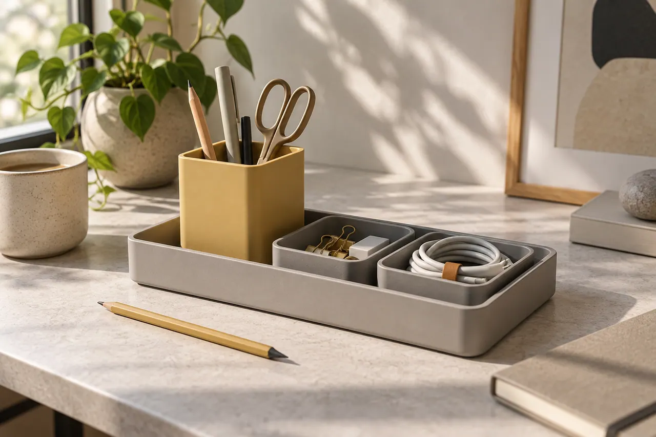
This workshop uses an original fictional product called ShiftDock. It consists of a shallow rectangular tray, a removable pen cup, and two small accessory bins. The imagined modules sit within the tray without magnets, powered features, or hidden mechanisms. A warm gray body and muted yellow cup give the product a recognizable visual identity. These are production assumptions for the exercise, not claims about a product available for purchase.
The campaign's central idea is a desk that changes with the task. One arrangement supports writing, another supports a small craft activity, and a third clears space for a laptop. The advertisements should demonstrate this flexibility with accurate objects and understandable movement. They should not imply that an organizer automatically improves concentration, productivity, or health.
Topview's official website describes video creation from ideas, scripts, references, and product URLs, with tools for planning and editing generated scenes. The following method is an independent production approach. Confirm the currently available controls and account options before use. The goal is to turn reliable product information into distinct advertising concepts, then evaluate those concepts without confusing attractive imagery with persuasive evidence.
Start with the product information that cannot change
Build a fact sheet before writing a hook. Record the product's dimensions, included pieces, materials, color names, care instructions, and any limitations supported by the seller. Keep uncertain details marked as unresolved. A video should not fill gaps by inventing a durable coating, a recycled material percentage, or compatibility with devices that nobody has checked.
For ShiftDock, the exercise needs only a modest set of truths: the modules are removable, the tray holds them in a stable arrangement, and the product is designed to organize small desk objects. A real campaign would replace these assumptions with verified information and real measurements. The creative concept can be ambitious while the factual foundation remains precise.
Attach clear source photographs from several angles. Include an empty tray, each separate module, a complete arrangement, and a close view of the edge profile. Use a ruler or measurement diagram in internal references when scale matters. Those reference images do not all need to appear in the advertisement, but they help detect distortions in generated scenes.
Create a list of prohibited implications alongside the approved facts. ShiftDock does not charge devices, attach magnetically, clean the desk, or expand automatically. A generated animation might suggest any of these if the prompt asks vaguely for a magical transformation. The fact sheet gives reviewers a concrete reason to reject an impressive shot that changes what the product appears to do.
Choose an audience situation instead of a broad demographic
A useful audience brief describes a situation the product can address. Someone who uses the same small desk for work and a hobby has a specific need: changing the arrangement without losing small tools. Someone who leaves a cable behind the monitor has a different need. Neither situation requires assumptions about age, income, or personality to become visually understandable.
Choose one primary situation for each concept. The first ShiftDock advertisement focuses on moving from notes to laptop work. The second focuses on a cable and small accessories that need a visible place. The third focuses on a craft session ending cleanly. These concepts share a product but offer different reasons to pay attention.
Write down what the audience already knows. Most people recognize pens, earbuds, cables, and a crowded surface. They do not need an explanation of what clutter is. The advertisement can begin with a concrete friction point, such as moving three loose objects before opening a notebook. That action communicates the situation faster than a generic statement about modern busy lives.
Avoid making the person in the scene appear incompetent or distressed merely to exaggerate the benefit. A relatable desk can be mildly inconvenient without becoming an absurd mountain of junk. The more believable the starting situation, the more credible the product's modest improvement becomes. This is particularly important when AI generation can easily make the before image unrealistically chaotic.
Distinguish a demonstration from a promise
A demonstration shows an observable action. A promise asserts an outcome beyond the visible action. Moving a pen cup to make room for a notebook is a demonstration. Claiming that the arrangement doubles daily productivity is a promise requiring separate evidence. Keep this distinction visible in the script and review process.
For ShiftDock, useful demonstrations include lifting one module, placing it in another position, grouping three loose accessories, and returning the tray to a shelf. Each action can be filmed or represented with approved accurate frames. The viewer can judge whether the arrangement would suit their own desk without being told that everyone will experience the same benefit.
The copy can describe the intended use without becoming exaggerated. Make room for the next task is more defensible than never lose focus again. A place for the small things is more concrete than transform your life. Simple language can still be engaging when the visual demonstration makes the meaning specific.
During review, underline every sentence that contains an implied result. Ask what evidence supports it and whether the image communicates the same limitation. If the script says reorganize your essentials while the video makes objects vanish, the combined message is misleading even though the words alone sound reasonable. Evaluate the whole advertisement, not just its written claims.
Build three concepts that differ in reasoning
Three versions are not truly distinct if they use the same shot sequence with different opening words. Give each concept a different argument. The task change concept says flexibility matters. The small objects concept says visibility matters. The end of session concept says a repeatable reset matters. These arguments lead to different openings, demonstrations, and endings.
For the task change version, begin with a notebook occupying the desk. A laptop enters the frame, and the modules shift to create a usable arrangement. For the visibility version, begin with a cable slipping behind another object, then show its place in the organizer. For the reset version, begin after a craft activity and show tools returning to their compartments.
Keep the product identity constant across the concepts. The same gray tray and yellow cup help viewers recognize ShiftDock even when the setting changes. The campaign can vary its story without changing the object's geometry, finish, or included pieces. This separation between stable product identity and variable creative argument is central to a useful test.
Write one sentence explaining why each concept might interest the audience. These are hypotheses, not predicted results. A viewer who frequently changes desk activities may respond to reconfiguration, while another may care more about seeing small accessories. The campaign learns something only if the variations correspond to meaningful differences in audience motivation.
Construct a proof ladder for each concept
A proof ladder moves from a recognizable situation to a visible action and then to a limited conclusion. For the task change concept, the situation is a desk arranged for writing. The action is moving the cup and accessory bin. The conclusion is that the same tray can support another arrangement. Nothing in that sequence proves a broader productivity claim.
Write the ladder before the script. This exposes missing evidence. If the conclusion is that the organizer saves space, the video needs a fair comparison of the occupied area. If the conclusion is that modules are easy to move, the action needs to show the actual lifting and placement. A beauty shot alone cannot carry either claim.
Keep comparisons honest by controlling the surroundings. Use the same desk, camera angle, objects, and framing for a before and after sequence. Removing half the belongings from the after shot would make the result look cleaner without demonstrating the organizer's contribution. Count the visible objects during continuity review if the comparison depends on them.
End the ladder with an invitation that matches the proof. See the available configurations directs the viewer toward more information. Buy the only organizer you will ever need makes an unsupported universal claim. A precise next step allows the advertisement to remain confident while respecting what its demonstration actually establishes.
Prepare source media for a product URL workflow
If a supported Topview workflow accepts a product URL, inspect the source page before using it as creative input. The page may contain old prices, several variants, shipping information, customer reviews, or unrelated recommended products. A generator can only work from the material it receives, so the brief should identify which information belongs to this campaign.
Create a concise approved summary alongside the URL. State the exact variant, included modules, campaign objective, and source images that should define the product. If the page shows both a small and large tray, specify which one appears in the advertisement. A product URL is a source, not a substitute for editorial selection.
Review any automatically proposed script against the fact sheet. Remove invented urgency, unverified superlatives, and customer statements that have no approved source. Check whether the script accidentally combines features from different variants. The most useful automation reduces preparation work while leaving the product owner in control of what is claimed.
When the source page lacks a necessary view, supply a better reference or change the planned shot. Do not ask a model to infer the underside of the tray and then present that invention as a product detail. A clear limitation in the reference material is a production decision to resolve, not an invitation to fill the gap with visual guesswork.
Capture reference photographs for geometry and material
Photograph ShiftDock against a plain background before placing it in a styled scene. Use a front three quarter view, an overhead view, a side profile, and an image of the separated modules. These views answer different questions about shape and assembly. Consistent light makes it easier to compare them and identify the actual surface finish.
Pay attention to the tray's corners and wall thickness. These are small details that can drift in generated images. A rounded rectangle may become a perfect rectangle, a shallow tray may become a deep box, or the pen cup may gain a handle. Mark the identifying geometry in the internal reference notes so reviewers know what to inspect.
Include a neutral object of familiar size in at least one internal reference. A standard notebook or measured grid can help the production team understand scale. Remove it from final compositions when it does not serve the advertisement. The aim is to ground the reference process, not to make every image look like a technical catalog.
Capture the intended material honestly. A matte polymer surface should not become polished ceramic simply because a generated version looks more luxurious. If the campaign uses a stylized illustration, keep that role clear. Product video advertising depends on the relationship between what viewers see and what they can reasonably expect to receive.
Write a shot list with a reason for every frame
A shot list should include purpose, framing, action, duration estimate, reference, and review criteria. For the task change concept, the first shot establishes the writing arrangement. The second shows the notebook closing. The third shows one module moving. The fourth reveals the laptop arrangement. The final shot supplies the product name and next step.
Each shot should contribute information that was not already obvious. Two nearly identical beauty shots can slow the sequence without improving understanding. A close view of the removable cup is useful if its movement matters, but unnecessary if the concept focuses entirely on the tray's overall footprint. Let the argument determine the coverage.
Plan where titles and captions will sit before generating or filming. A hand entering from the bottom can collide with a lower caption. A cup placed near the right edge may be hidden by interface controls in a vertical feed. Keep essential action near a comfortably visible region and test the composition in the actual intended crop.
Write a pass condition for the difficult shots. The module keeps its shape. The hand remains anatomically plausible. The desk objects do not disappear. The final arrangement contains the same belongings as the opening. These criteria turn review into a concrete task and help the team reject a polished clip that fails the product demonstration.
Use image generation for controlled scene development

AI image generation can help explore backgrounds, lighting, and composition before motion production. Begin with a scene that supports the product's purpose. A compact desk beside a soft window light gives the organizer a plausible context. A vast marble office may look impressive but weaken the small desk problem the concept is trying to solve.
A scene development prompt could read: Create a quiet compact home workspace with a pale wood desk and a warm off white wall. Soft daylight enters from the left. Leave a clear central area for a separately supplied modular desk organizer. Include one closed notebook and a simple lamp toward the back. Eye level slightly above the desktop, restrained colors, natural materials, no written text or logos.
Use the generated result as a concept reference unless the product insertion process preserves the actual object accurately. Inspect contact shadows and perspective when compositing or editing. A tray floating above the desk or casting light in the wrong direction can make the entire scene feel artificial even when the object itself is unchanged.
A GPT AI Image Generator Prompt can use this same structure: setting, light, camera position, object relationships, and exclusions. The keyword does not guarantee a particular model is available in Topview. Choose the current tool that supports the required task, and retain the approved product photograph as the reference against which the final scene is judged.
Direct motion with physical constraints
Motion prompts should state what moves and what remains stable. For a scene showing the cup moving from the tray's left side to the right, the camera can remain locked. The tray, notebook, and background should not move. A single controlled action makes both generation and review more manageable than a sweeping camera move during a complicated rearrangement.
If using an accurate starting image, a motion instruction could describe one adult hand gently lifting the yellow cup and placing it in an open position within the gray tray. Ask for slow deliberate movement and stable product geometry. Treat the output as a candidate that must be inspected, not as proof that the specified action happened correctly.
Hands touching small objects are demanding. If the clip merges fingers with the cup or changes the tray during contact, consider real footage. Another option is a clean cut between two approved arrangements with an explanatory title. The choice should follow the communication goal rather than a desire to make every second entirely generated.
Avoid physically impossible transformations. Modules should not slide through each other, grow extra compartments, or attract themselves magnetically when the product has no such mechanism. Even a brief impossible action can change a viewer's understanding of the product. Watch the clip at normal speed and frame by frame around contact points before approving it for advertising.
Build the opening around a specific observation
The opening should make a relevant viewer recognize a situation. For the task change concept, show the notebook and laptop competing for the same space. For the visibility concept, show a cable end disappearing behind a stack. For the reset concept, show a few tools left after a small project. Each observation offers a concrete reason to continue watching.
The written hook should sharpen what the image already shows. One desk, two different jobs fits the first concept. Give the small things a visible place fits the second. Ready for the next session fits the third. These lines are illustrative creative options, not claims of proven performance. Their value depends on how clearly the accompanying sequence supports them.
Keep the opening product relevant. A surprising unrelated image may attract attention while attracting the wrong expectation. If the advertisement begins with a dramatic collapsing room, the eventual desk organizer can feel like an anticlimax. A modest but recognizable problem is often a better foundation for a credible demonstration.
Prepare a small number of opening variants before changing the rest of the edit. One can start with the friction point, another with the satisfying completed arrangement. Compare what each version makes viewers understand about the product. This is a clearer experiment than simultaneously changing the hook, music, setting, voice, and offer and then guessing which change mattered.
Write spoken copy that follows the hands
The narration should align with visible actions. When the cup lifts, a line about moving the pieces has immediate meaning. When the laptop appears, a line about making room for the next task resolves the sequence. If the voice discusses material quality while the video demonstrates rearrangement, the audience has to process two unrelated ideas at once.
A draft for the task change concept might say: Notes first. Laptop next. Move the cup, shift the small things, and keep the essentials together. ShiftDock is a modular organizer for a desk that does more than one job. Explore the arrangement that fits your space. A real advertisement would confirm the final product description and destination before use.
Read the copy at a natural speed over the rough edit. If the words only fit when rushed, shorten them. Remove adjectives before removing the action verbs that explain the demonstration. The audience needs to understand move, place, and arrange more than they need repeated descriptions of the product as elegant or innovative.
Leave some actions unspoken. The gentle sound of a module settling can communicate tactility. A brief pause before the finished arrangement lets the viewer inspect it. Narration should guide attention, not occupy every available second. A clear sequence with a few well timed lines can communicate more than a dense script covering several features at once.
Decide whether a presenter adds evidence or distraction
A presenter can introduce the use case, explain a choice, or make the pacing feel conversational. But a presenter is not automatically necessary for a product that can demonstrate itself. For ShiftDock, an overhead arrangement may be clearer than a talking head holding a small object near the edge of the frame.
If an AI presenter is used in a supported workflow, write the role honestly. The presenter can explain an example setup. They should not claim to have used the organizer for months, received a package, or experienced a personal improvement unless that statement comes from an actual authorized person with a real basis. A synthetic delivery does not create a real testimonial.
Keep the product large enough to inspect. A presenter scene can introduce the problem, followed by a close demonstration using accurate media. Trying to show a tiny module and a face in the same shot may make both harder to read on a phone. Choose framing according to the information the viewer needs at each moment.
Evaluate the presenter version against a product only version with the same core argument. Does the speaker make the benefit clearer, or merely add length? Does their tone fit a practical desk product? The answer may differ between a short feed advertisement and a longer product page video. Use the role deliberately rather than treating a face as a universal requirement.
Add typography after the image has earned its meaning
Text overlays should summarize, label, or direct attention. They should not rescue a demonstration that cannot be understood visually. If the modules appear to change shape, a caption saying removable modules does not fix the problem. Repair the visual evidence first, then use typography to reinforce the intended interpretation.
Keep the hierarchy simple. One short hook, a small number of explanatory labels, and a final next step are usually enough for this exercise. Use consistent placement and type size across variants so the test is about the creative argument rather than arbitrary design differences. Leave enough contrast behind the text and review it at actual phone size.
Add brand names and product labels through the editing or design workflow when possible. This gives control over spelling, alignment, and spacing. Generated images can be useful for scene development, but the final logo should come from approved artwork. A nearly correct wordmark still looks wrong and can reduce confidence in the product page that follows.
Create captions from the final approved voice track and verify them manually. Check module names, product spelling, and the timing of short lines. Avoid placing captions over the hand action or the tray's important edge. Accessibility and persuasive clarity often support the same design choice: make the words readable and give the product room to be seen.
Use sound to clarify contact and pace
Sound can make a modular product feel tangible. A soft placement sound can emphasize that the cup has been moved, while a restrained music bed can maintain pace between actions. Use actual recordings when available and keep the sound consistent with the material. A heavy ceramic clunk would misrepresent a lightweight plastic module.
Choose music that leaves space for narration and small product sounds. The track does not need to dramatize an ordinary desk rearrangement into a major transformation. A light steady rhythm can support deliberate movement. If the music becomes the most noticeable element, reduce it or choose a simpler arrangement.
Review the advertisement at a moderate volume on a small speaker. A balanced headphone mix can hide an overly quiet voice or a sharp placement sound. Also review the silent version, because the opening and demonstration should remain understandable without audio. The sound layer should improve the experience without carrying all essential information.
Keep voice, music, and effects separate in the working edit when possible. This makes it easier to create a version without narration, replace a music cue, or localize the spoken copy. A single flattened audio file may be convenient for one export, but it makes later changes harder and can force unnecessary work on an otherwise approved visual sequence.
Build a rough advertisement before polishing every shot
A rough cut can use still images, simple arrows, temporary text, and a scratch voice recording. Its purpose is to test the argument. Does the viewer see the desk situation, understand the modular action, and recognize the finished arrangement? If those answers are uncertain, polished generation should wait until the sequence is clearer.
Show the rough version to someone unfamiliar with ShiftDock. Ask what the organizer includes and what changed during the video. Their answer may reveal that the cup appears permanently attached or that the tray seems larger than intended. These are useful production findings. Do not explain the product first, because that would supply information the advertisement should communicate on its own.
If the viewer notices the attractive room but cannot describe the organizer, move the product earlier and increase its screen presence. If they understand the object but miss the rearrangement, simplify the action or add a clearer before frame. Each revision should respond to a specific misunderstanding instead of adding more visual decoration.
Approve the rough structure separately from final visual quality. The structure may be correct even while a temporary image is unattractive. Conversely, a beautiful cut can still lack an understandable product argument. Keeping these reviews separate helps the team invest effort in the right problem and reduces the temptation to approve an unclear advertisement because it looks finished.
Adapt the composition for each viewing shape
A wide product page video and a vertical feed advertisement need different framing. The wide version can show the relationship between the organizer, notebook, and laptop. The vertical version may need to focus on the tray and one action at a time. Cropping the same wide frame can remove the evidence that makes the demonstration understandable.
Plan an essential region for each shot. The moving module, the destination space, and the hand's path must remain visible. Background decoration can disappear without harming the argument. Use this distinction to decide whether a crop works or whether the shot needs a new composition. A format adaptation is an editorial decision, not merely a resize operation.
Review titles and captions in the target layout. Interface elements can cover parts of a vertical video, and a desktop title may become too small after scaling. Keep critical text away from crowded edges and check the final export in a realistic preview. The correct position depends on the destination, so verify current placement requirements rather than relying on a remembered template.
Preserve the same product scale across adjacent shots where possible. A sudden jump from a tiny tray to an enormous close view can be useful if intentional, but it can also confuse the perceived dimensions. Include a familiar object or a consistent tabletop view when size is important to the purchasing decision.
Review the advertisement as a product inspector
The final visual review should be slower than the viewing experience. Pause at the start, middle, and end of each shot. Inspect module count, edge shape, surface finish, color, and contact with the desk. During movement, look for objects merging, disappearing, or changing size. A defect visible for only a few frames can still create a misleading impression.
Compare every factual title with the approved brief. Check that the demonstrated arrangement is possible with the included pieces. Confirm that the video does not show additional accessories as though they arrive in the box. If pens, a notebook, or a cable are styling props, the product page should make the package contents clear.
Watch the complete advertisement without pausing after the detailed inspection. The sequence should feel natural and easy to follow. A collection of individually accurate shots can still create a confusing story if the edit implies an action that never occurs. Evaluate the transitions and the order of information as carefully as the frames themselves.
Finally, open the destination page from the actual advertisement link. The product variant, name, imagery, and offer should match. A strong video that leads to a different color or outdated description can create doubt at the moment of interest. The campaign is one continuous experience from the first frame to the information the viewer finds next.
Design a test that can answer a limited question
A creative test should begin with a question narrow enough to interpret. Does an opening demonstration communicate the organizer faster than an opening problem shot? Does a task change story attract a different response from a small objects story? These questions connect the test to a production decision rather than to a vague search for the best advertisement.
Keep a record of the version, audience setting, destination, date range, and measurement method. When practical, hold major variables stable while comparing the creative difference. Real advertising environments contain noise, so describe the result as evidence within those conditions rather than a universal rule about what every audience prefers.
Choose measures that reflect the campaign objective. Viewing behavior can indicate whether the opening holds attention. Visits to a product page can indicate curiosity. Product questions can reveal whether the demonstration was clear. Purchases involve additional factors such as price, availability, trust, and checkout experience, so do not attribute them solely to a generated video.
Avoid inventing case study numbers for an untested concept. This workshop provides a method and hypothetical creative options, not reported performance. A useful testing note can say that the visibility concept needs evaluation, explain the intended question, and define what would justify keeping or revising it. Honest uncertainty makes the next production decision more reliable.
Read feedback for misunderstandings as well as preferences
Comments and questions can reveal what the advertisement accidentally implies. If viewers ask whether ShiftDock charges a phone, inspect any cable placement, glowing light, or electronic sound in the creative. The confusion may come from a small visual cue. Removing that cue can improve accuracy more effectively than adding another line of sales copy.
Separate preference feedback from factual confusion. Someone may dislike the yellow cup but understand the product perfectly. Another person may like the room while misunderstanding the module system. These reactions require different responses. Color preference can inform a variant or targeting decision; misunderstanding points toward the explanation itself.
Look for repeated patterns rather than reacting to every isolated opinion. Record the exact question, the version that prompted it, and the relevant shot. This makes feedback actionable. A note saying people are confused is difficult to use, while several questions about whether the cup is removable suggest a specific demonstration to improve.
Use feedback to create the next brief. The next round might show the cup separated before placing it in the tray, or include a clearer final arrangement. Keep the successful parts of the current concept instead of replacing everything. A disciplined Topview AI workflow accumulates useful knowledge about the product and audience across revisions.
Keep an asset library with reasons for approval
Save the approved source photographs, prompts, generated candidates, final clips, scripts, captions, and exports in a structured project folder. Give each asset a meaningful identifier tied to its concept and shot. A file named visibility_cable_closeup conveys more than a long automatic generation identifier, though the original identifier can remain in the ledger for traceability.
Record why a candidate was approved or rejected. One version may preserve geometry but fail the mobile crop. Another may have excellent light but invent an extra compartment. These notes prevent the same mistakes from being rediscovered in the next campaign and help collaborators understand the standards without relying on memory.
Keep product references separate from campaign explorations. If the product changes, update the reference set and identify which existing assets are affected. A new cup shape might require replacing several demonstrations but leave a background scene usable. This dependency awareness makes the library practical rather than merely large.
Retain editable titles and separate audio where possible. Future localization, destination changes, or seasonal copy should not require regenerating an accurate product shot. The most efficient production system preserves the decisions that are already correct and makes the remaining variables easy to change. Organization supports creative speed because it reduces uncertainty about what can safely be reused.
Finish with a clear next production decision
The completed ShiftDock package should contain three distinct concept edits, accurate product references, readable captions, suitable format versions, and a documented review. It should also identify the next question to test. Perhaps the task change story is clearest, while the visibility story needs a stronger opening. The production is useful when it leads to a concrete decision rather than an unexplained pile of variations.
A Topview AI product video process works best when generation is connected to product knowledge. The brief determines the argument, the source media protects accuracy, the shot plan makes evidence visible, and the edit guides attention. AI generated scenes can contribute to that system, but they do not replace the need to decide what viewers should understand.
The central discipline is modest and repeatable: show a real situation, demonstrate an actual change, and make a proportionate invitation. For a modular desk organizer, that might mean one cup moving, one notebook gaining room, and one clear view of the finished arrangement. Such a sequence can be more informative than a dramatic transformation filled with effects.
Keep the campaign's learning attached to its assets. When a future creator opens the project, they should know which product facts are fixed, which concepts were explored, which shots passed inspection, and which questions remain unanswered. That record turns one advertisement into a foundation for better product communication across the next set of videos.
Official sources and further reading
Use these first-party pages to confirm current product access and controls. Creative exercises in this article describe a proposed workflow rather than a claim that every control is available in every plan.